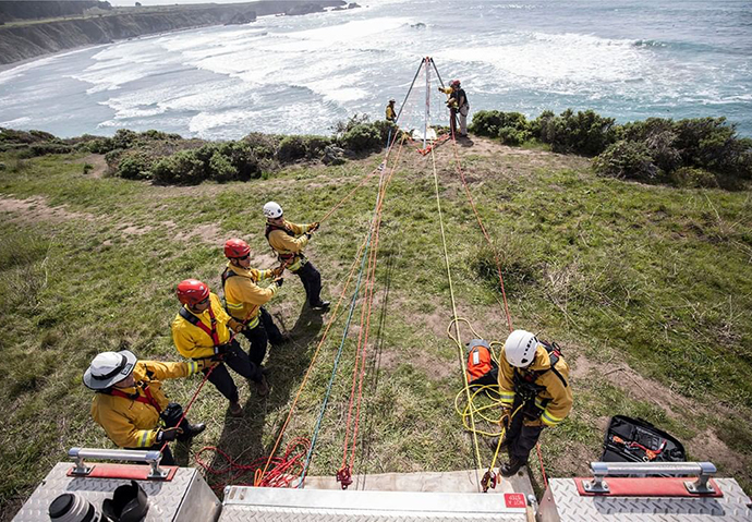
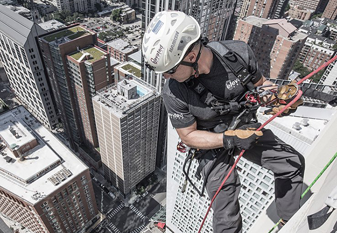
Providing life-saving equipment to rescue workers
- User experience
- Digital design
- Graphic design

My Role
Deliverables for CMC stemmed from an in-depth analysis of their existing website and an evaluation as to how strategic marketing can help them achieve clear business goals.
My proposal for redesigning and reengineering the existing website was approved and the project is scheduled for development in the coming year.
Design goals:
- Information architecture: Improve navigation throughout site and dense catalog of equipment
- Target audience: Allow customers to easily self-select relevant products and information
- Clear communication: Uphold the tradition of education, acting as a learning center
- Commerce: Online sales are expected to increase as a result of the redesign
- User testing: Allow for calculated risks by incorporating metrics
The Proposed
New Website
KEY ISSUE #1
Differentiate “Rescue” & “Access” customers
Acknowledge the addition of “Rope Access” as an emerging, new target market… Wanting to expand from the “Rescue” industry into the “Rope Access” market, their business objectives were clearly laid out. This brought in a new set of gear and culture and a redesign of their website was necessary in order to achieve their goals. Hand drawn sitemap for new website describing page flow and navigation differentiating the Rescue and Access target markets.
RESCUE = search & rescue, fire fighters


CMC Home Page
RESCUE Landing Page
ACCESS = rope access, work-at-height


CMC Home Page
ACCESS Landing Page
The Proposed
New Website
KEY ISSUE #2
Highlight “Shop” & “Learn” as site’s main call to action
Call to action Low-fidelity wireframes were created using Adobe XD. My design solution calls for streamlined navigation, enabling the user to self-select between the Rescue and Access markets, both as a first step and at any point throughout the user’s journey. Bring to light the CMC school.
SHOP equipment & gear
SHOP navigation on the RESCUE Landing Page
SHOP navigation on the ACCESS Landing Page
LEARN the trade
LEARN navigation on the RESCUE Landing Page
LEARN navigation on the ACCESS Landing Page
The Proposed
New Website
KEY ISSUE #3
Improve information architecture & general navigation
Low-fidelity wireframes were created using Adobe XD. My design solution calls for streamlined navigation, enabling the user to self-select between the Rescue and Access markets, both as a first step and at any point throughout the user’s journey.

The Existing
Old Website
Poor navigation, limited interest above the fold
Besides improving navigation, another major focus was to entice users to scroll down the page by making sure the photo did not take up the entire screen above the fold.


